
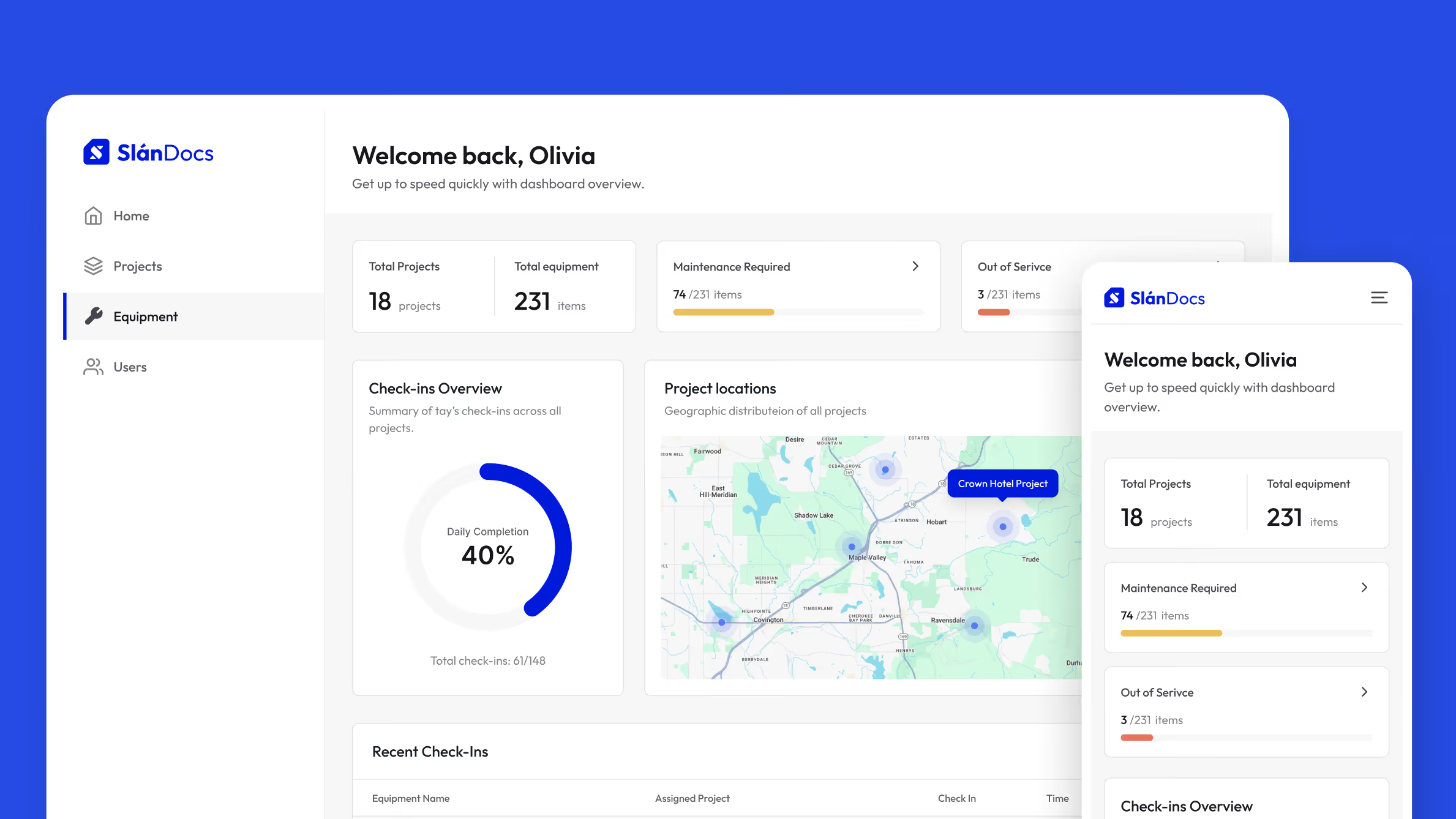
PROBLEM & SOLUTION

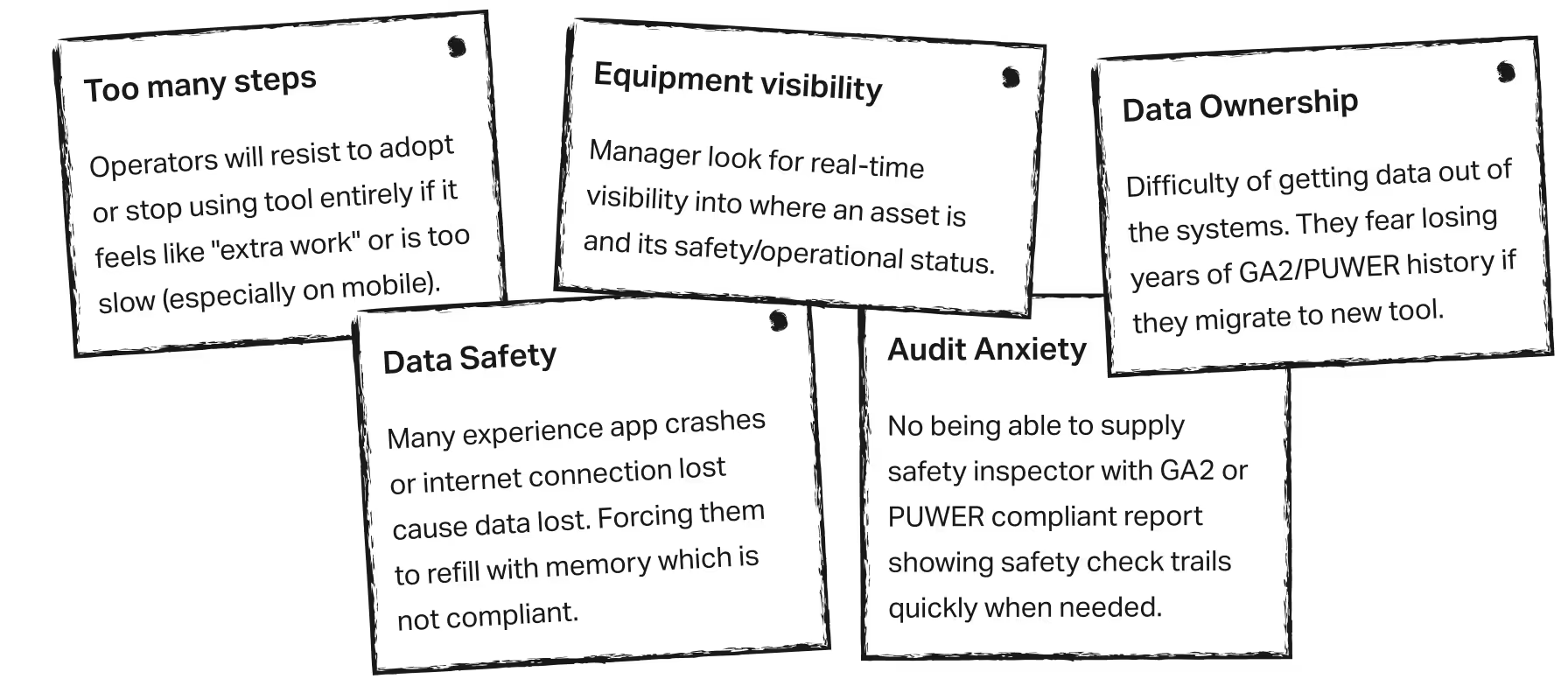
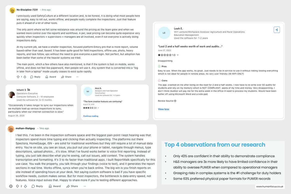
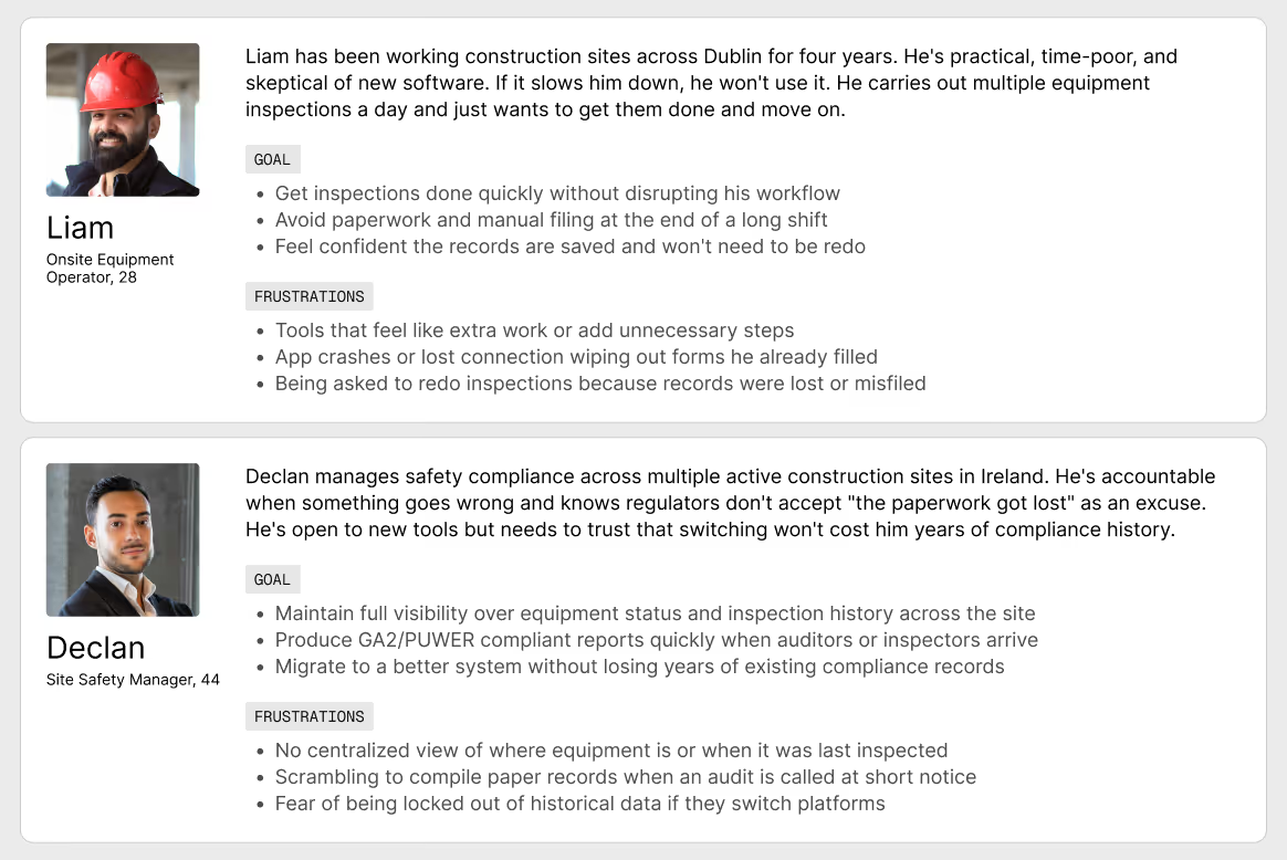
DISCOVERY
Insights:
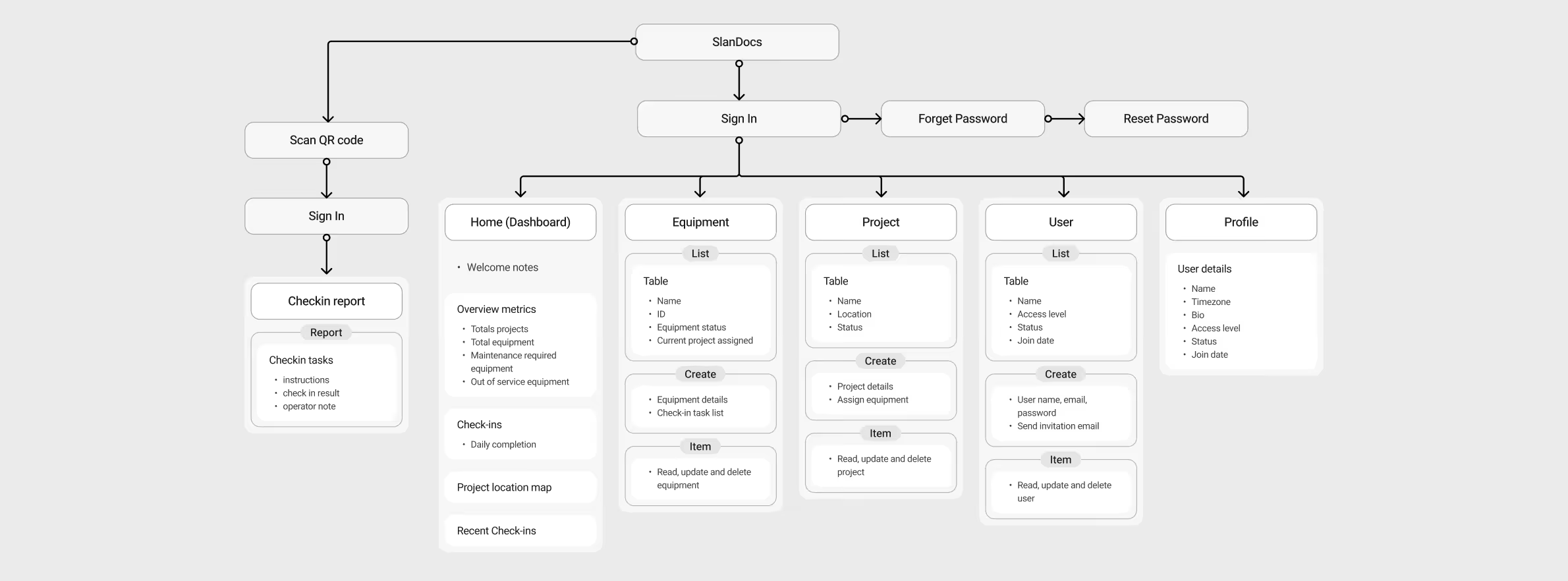
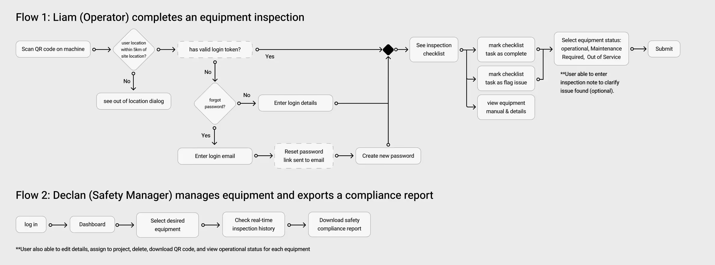
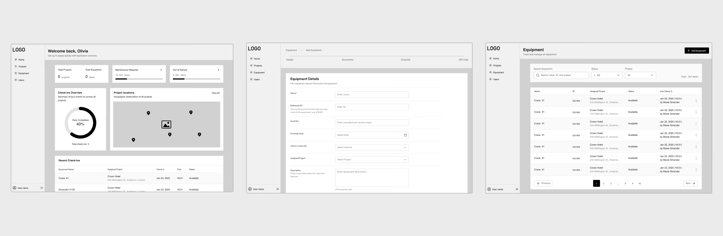
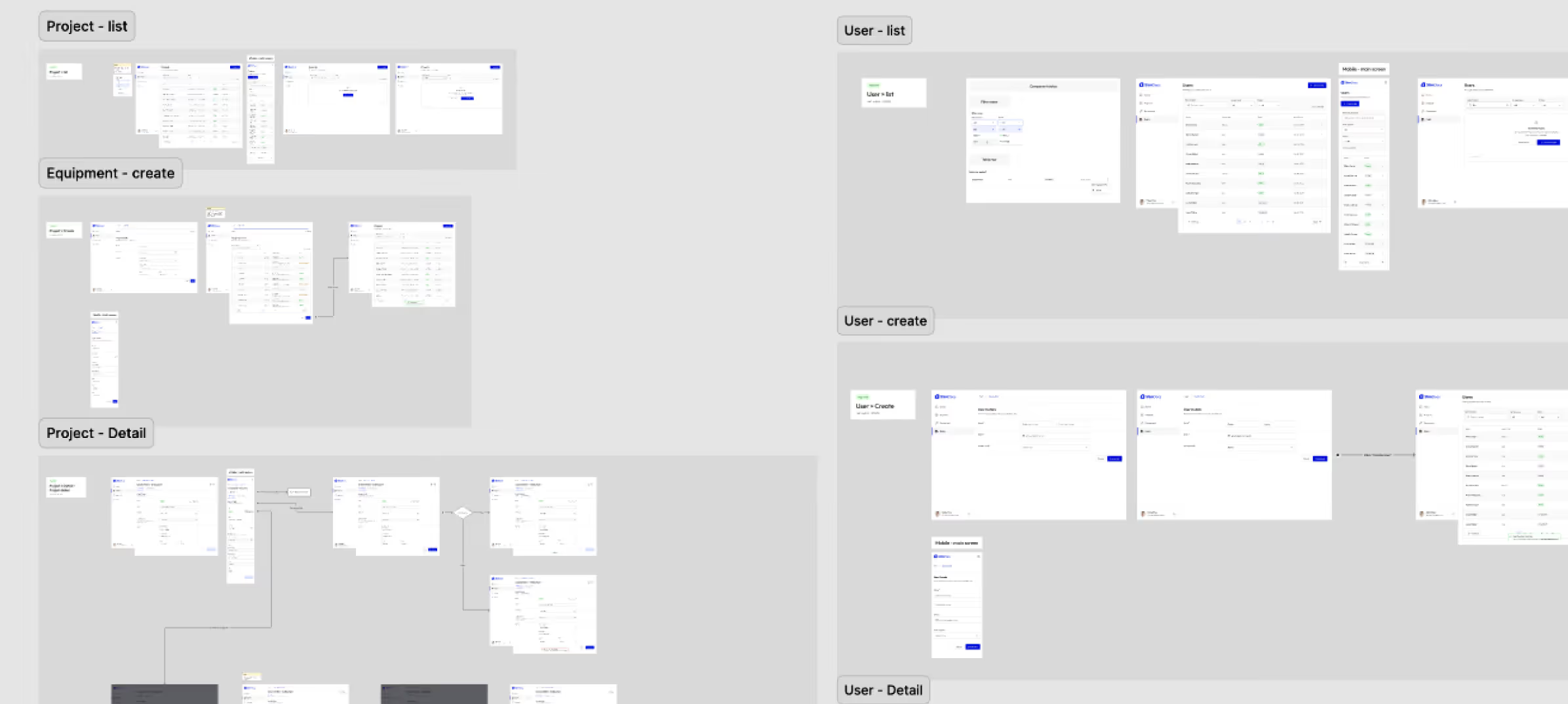
Information Architecture & userflows
Branding
Logo Mark
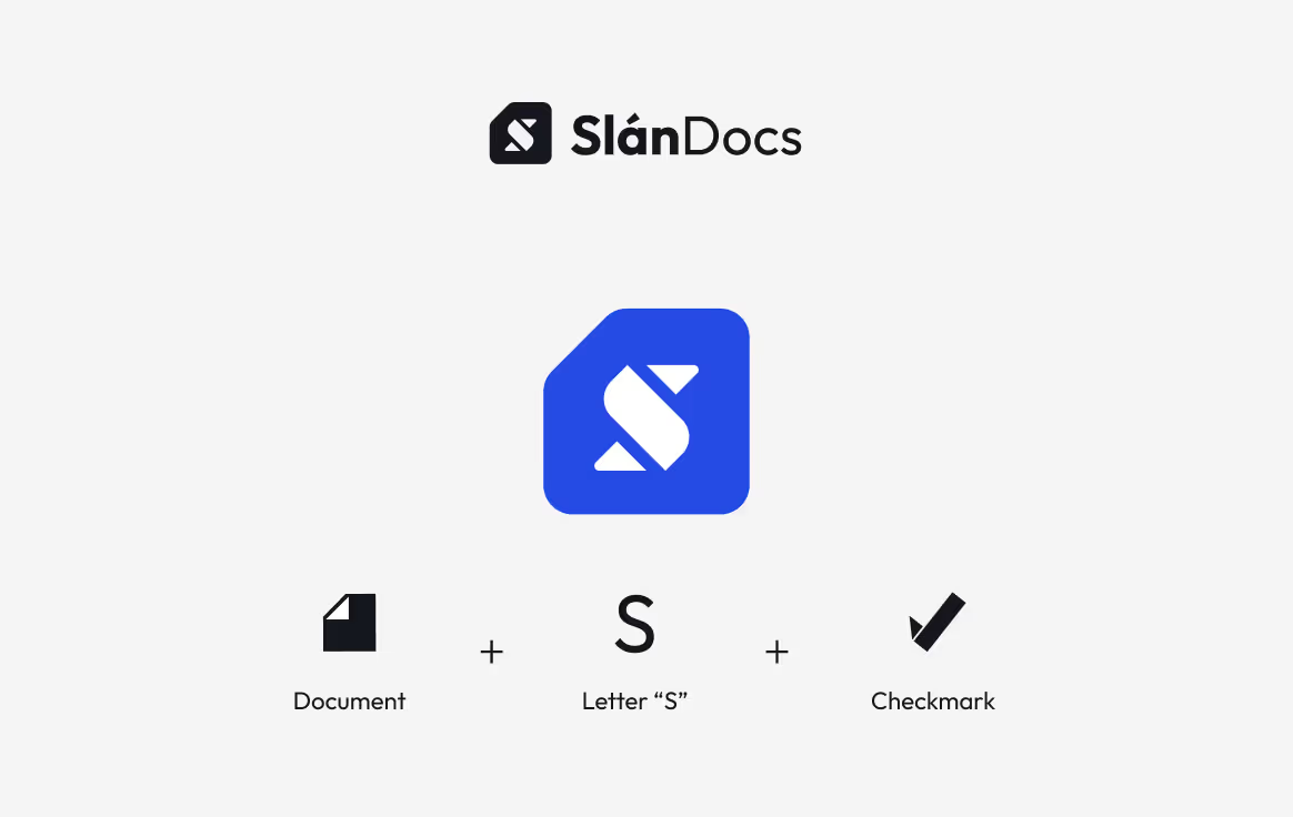
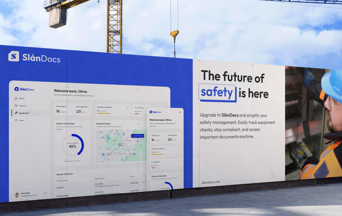
Logomark emphasizes the Irish word “Slán”, meaning safe, by having letter “S” as the focal point. The meaning of “safe” is also conveyed through the use of rounded corners reinforcing the brand's commitment to security and reliability.
Additionally, a checkmark is incorporated to visually highlight the app’s core functionality which revolves around task list.
Typography
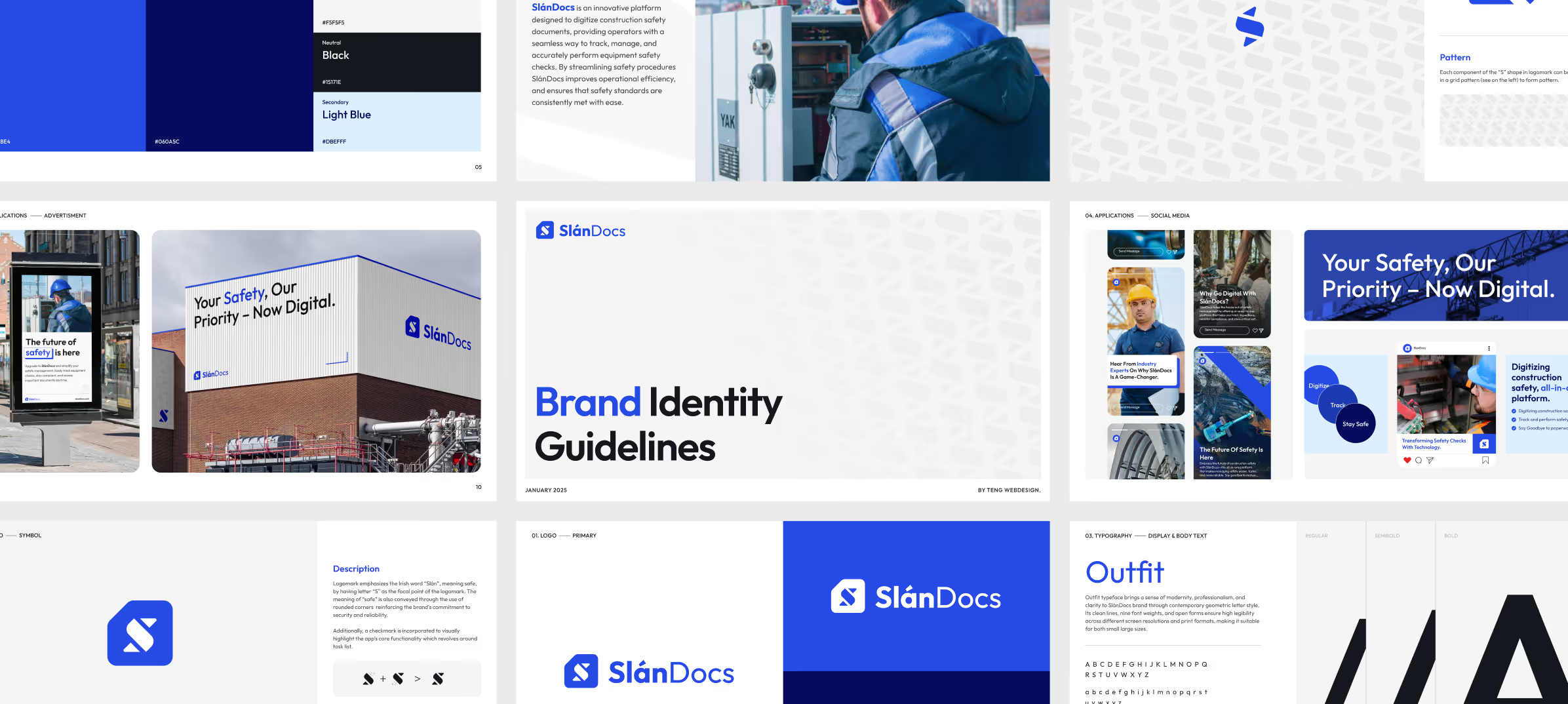
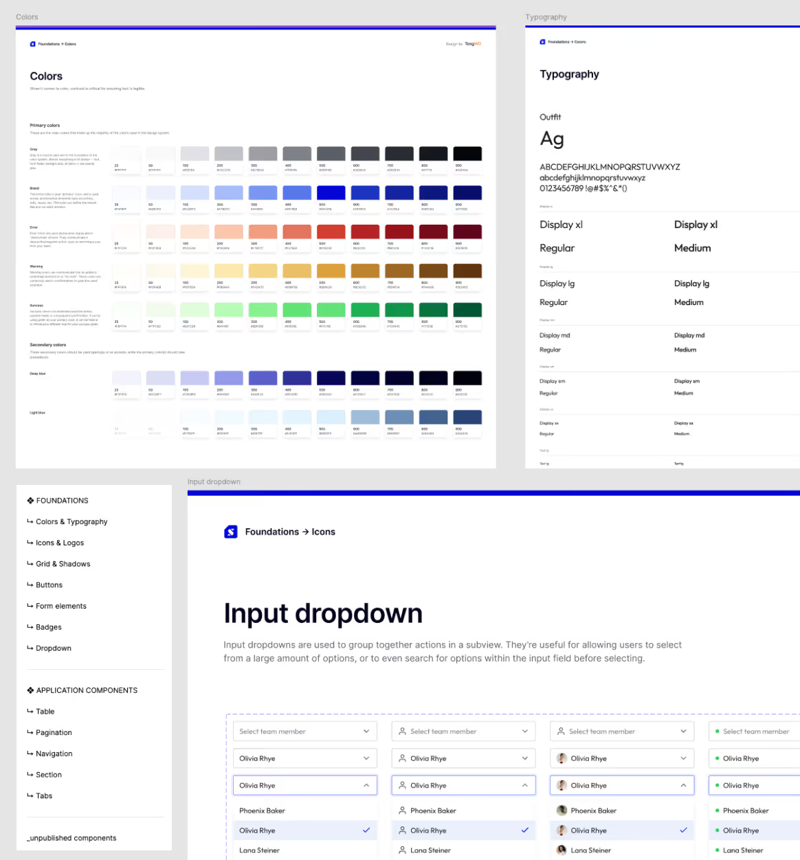
Outfit typeface brings a sense of modernity, professionalism, and clarity to the brand through contemporary geometric letter style. Its clean lines, and open forms ensure high legibility across screens and print formats.
Colors
The identity uses varying shades of blue to communicate professionalism, with stark contrast against light gray and black.
Design
Key Pages
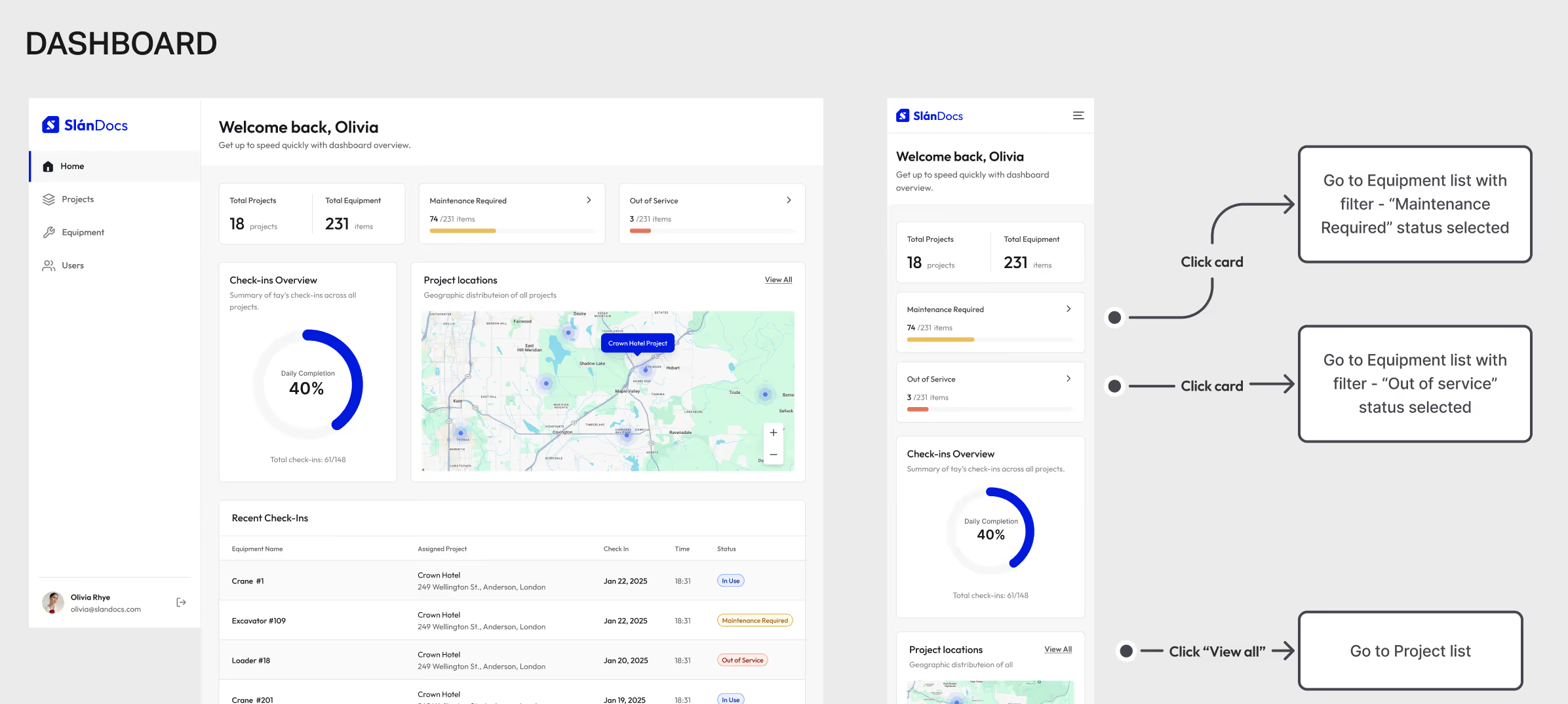
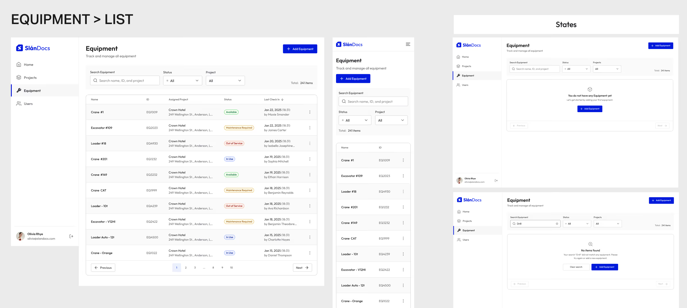
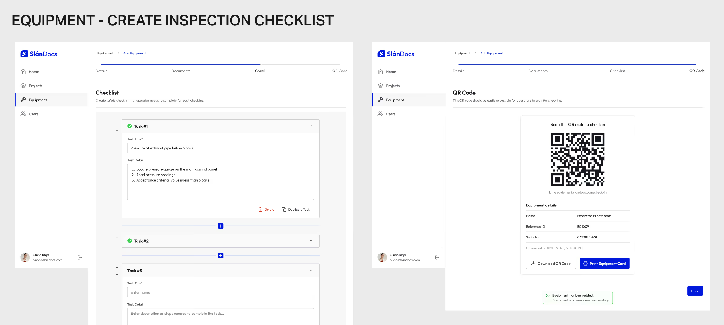
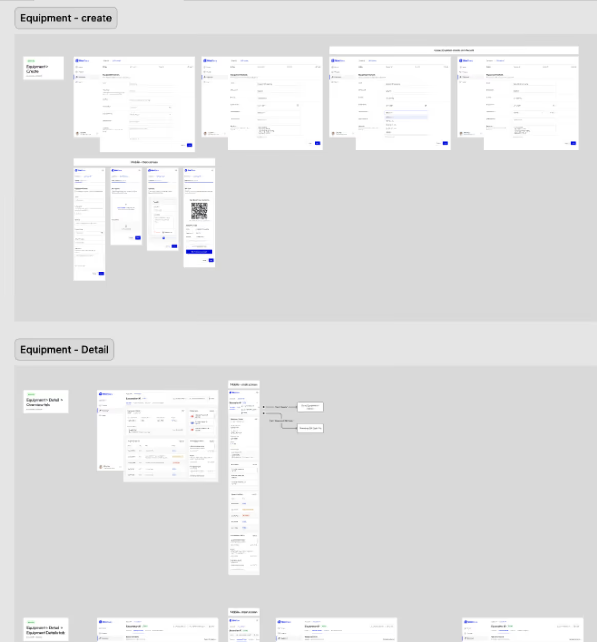
Developer Handoff
outcome
Due to project constraints, direct user research with construction workers across Ireland and the UK was not possible during this phase. Social listening provided a strong foundation, but insights remain unvalidated against the real experiences of local end users. For the next phase, I would prioritize:
- User interviews to validate social listening insights and surface pain points specific to Irish and UK construction workers.
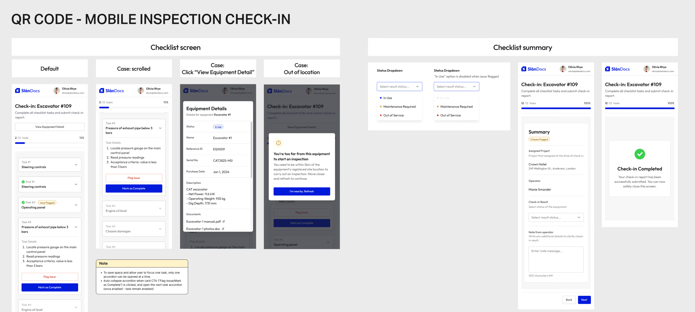
- Usability testing focused on the equipment creation flow and QR code inspection flow, both critical paths where friction would directly impact adoption and compliance accuracy
- Inspection scheduling & reminders for onsite operators.
- Common ERP platform integration so business unit personnels are notified of procurement or maintenance needs once operator flagged issue.
- Inspection history export & import support to ease customer migrating from current platform to SlánDocs and local data safe keeping.