
PROBLEM & SOLUTION
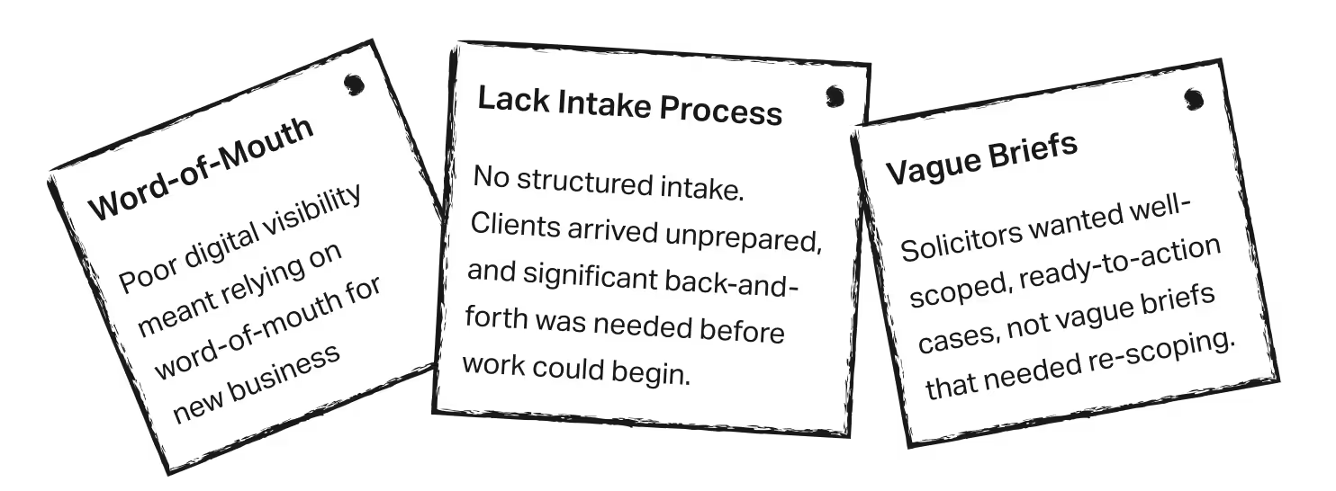
"On the solicitor's side, solo practitioners struggle with digital visibility and consistent case flow. Also, their intake process is manual and time-consuming.

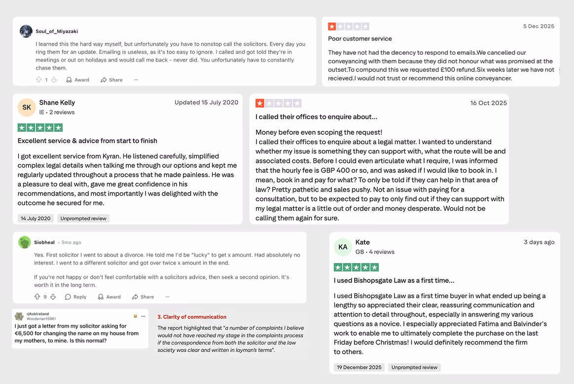
DISCOVERY
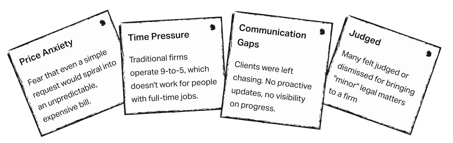
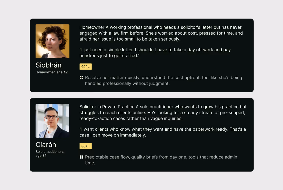
Insights: Client Side
Insights: Solicitor Side
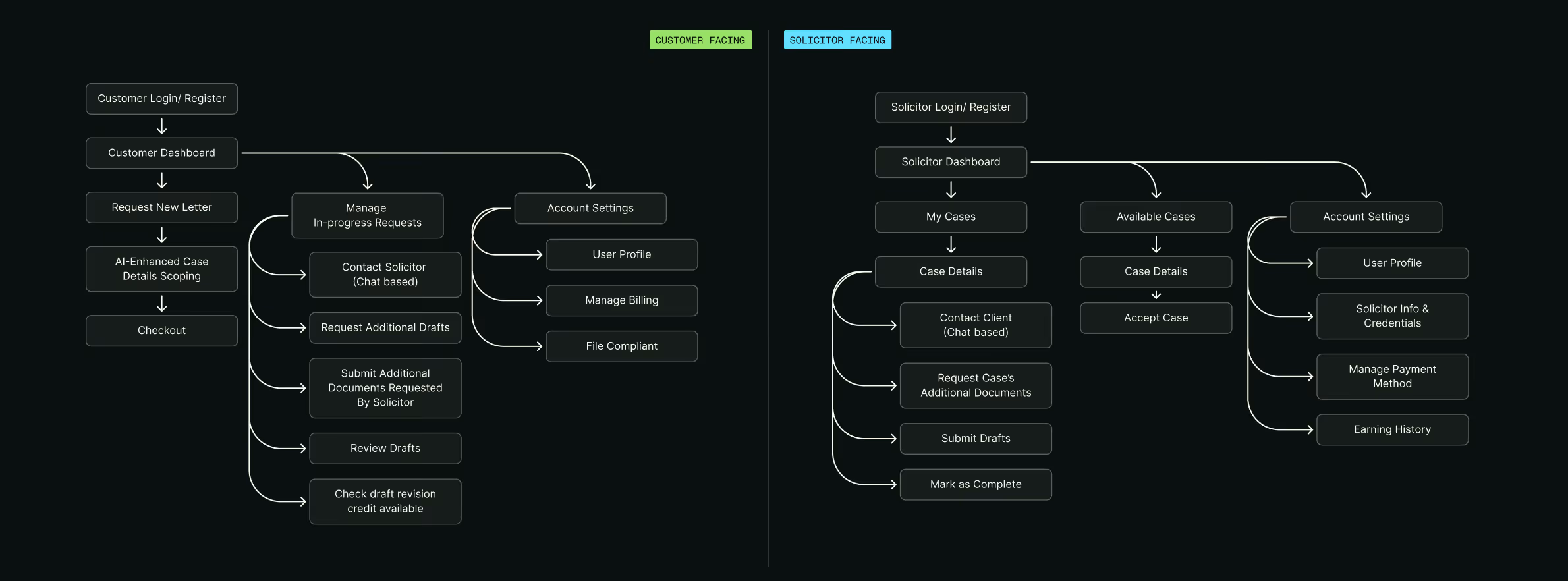
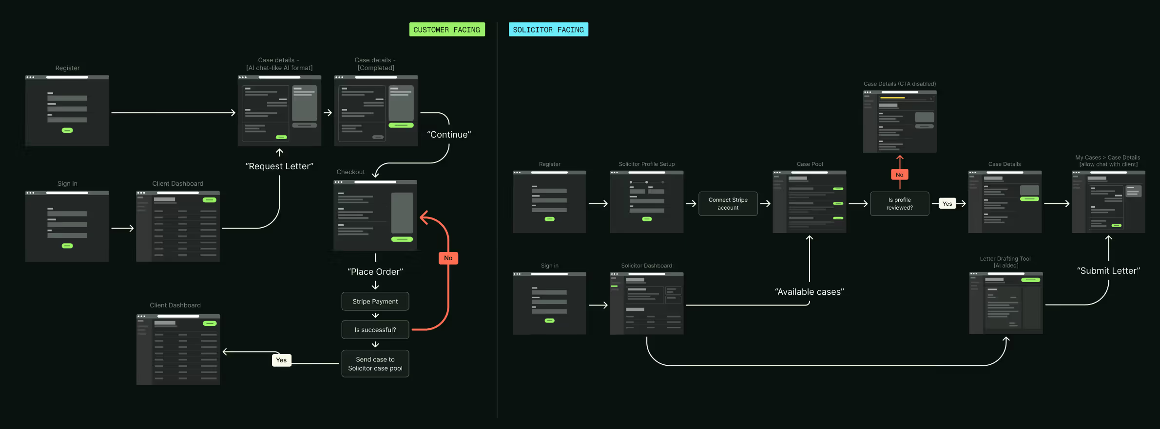
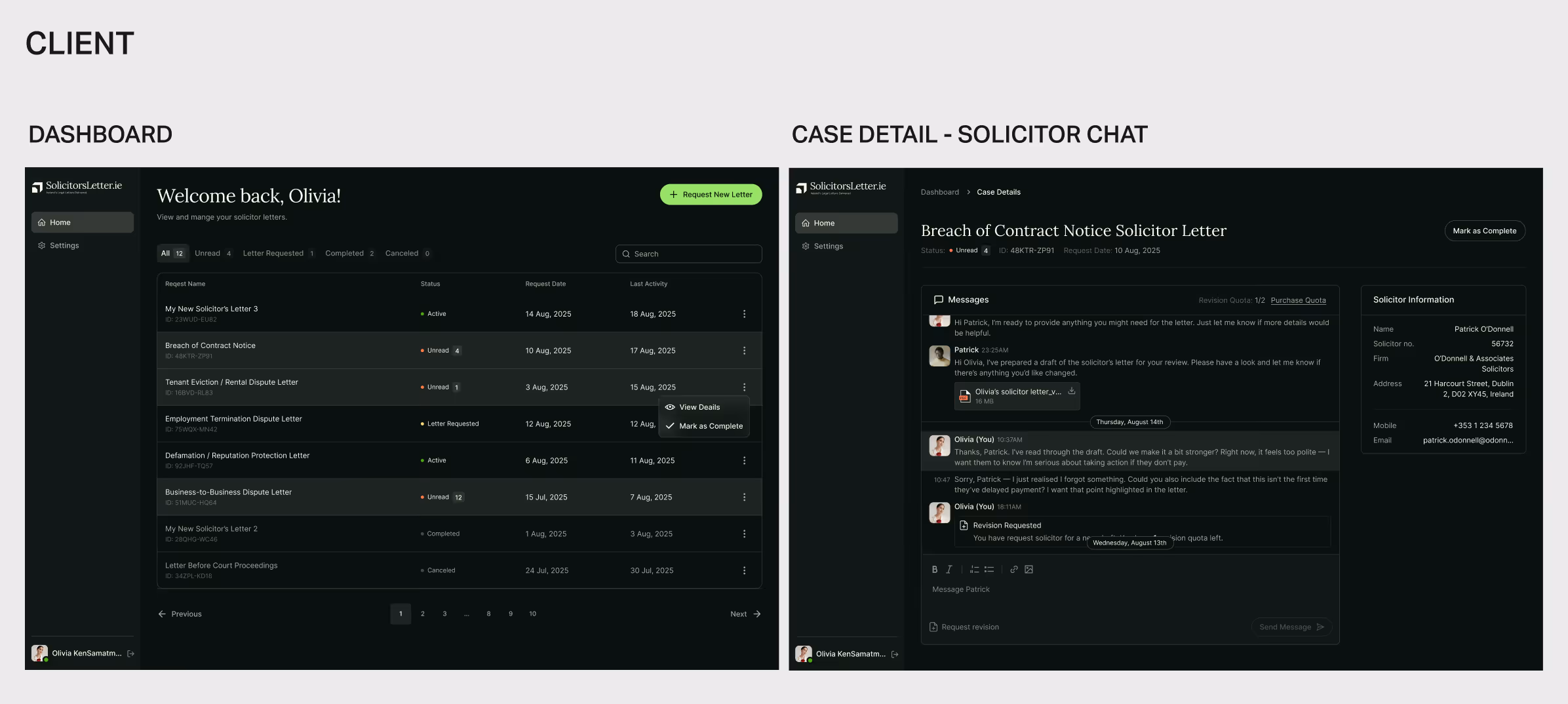
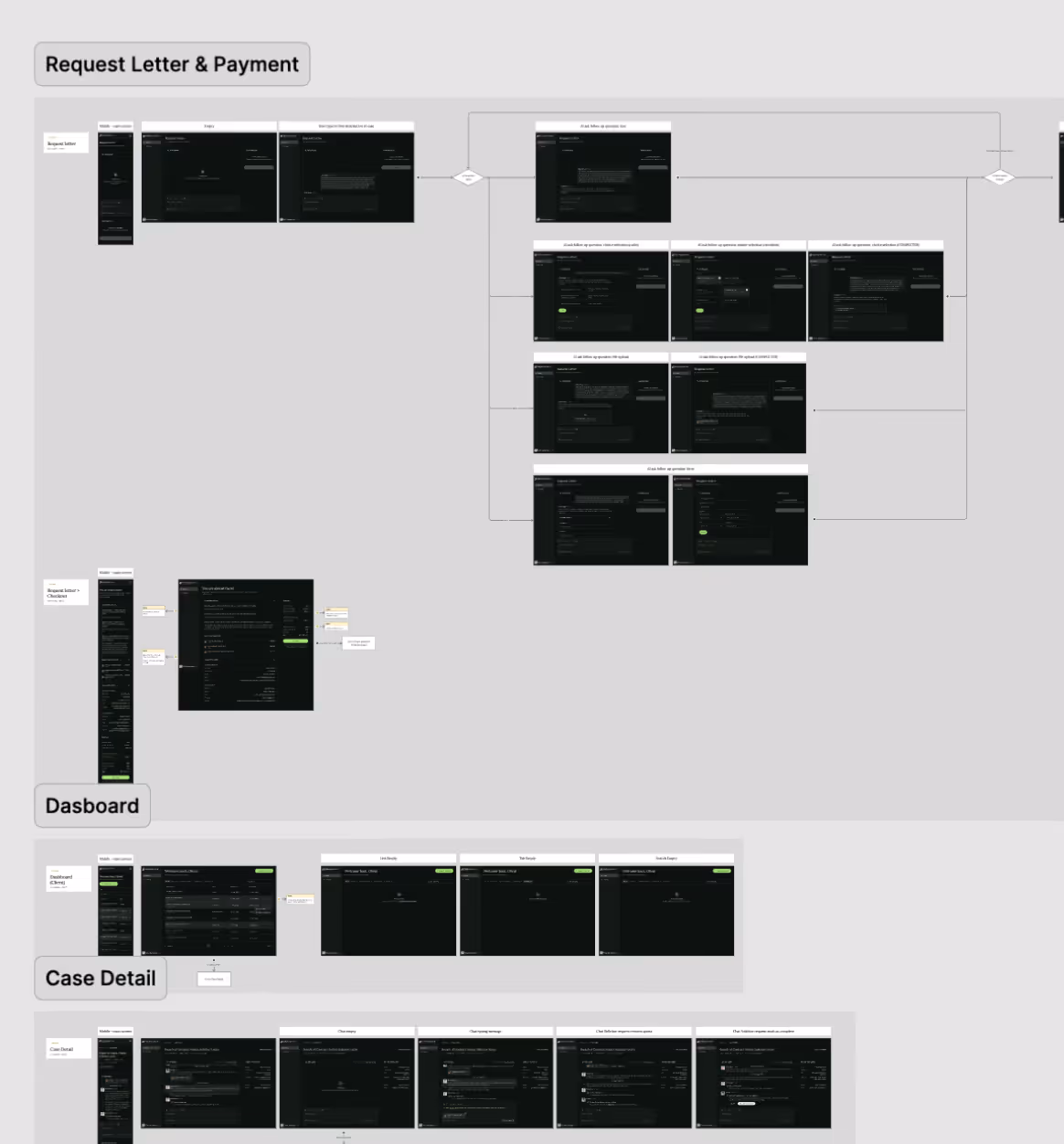
Information Architecture & Wireflows
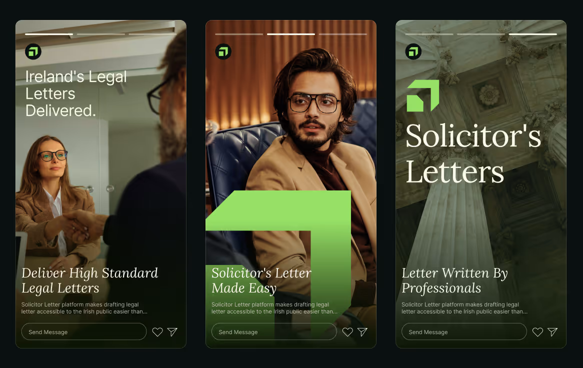
Branding
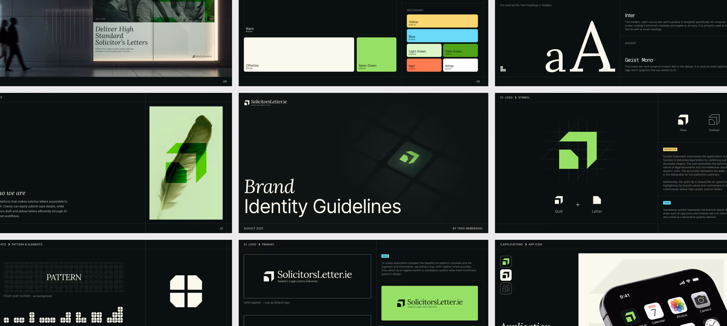
Logo Mark
The mark combines a quill and a document (writing meets legal delivery). The form is geometric and minimal, balancing the authority of legal services with the accessibility of a modern AI-native digital platform.

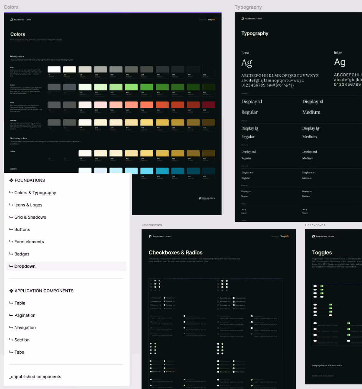
Typography
Lora serif headings for contemporary modern feel, formal enough to carry legal authority. Paired with Inter for body copy, optimized for screen legibility at all sizes.
Colors
A dark-theme palette with high-contrast neon green as the primary action color, a nod to the Irish flag while signalling a tech-forward product. The dark base communicates premium and trust; the bright accent keeps interactions sharp and decisive.
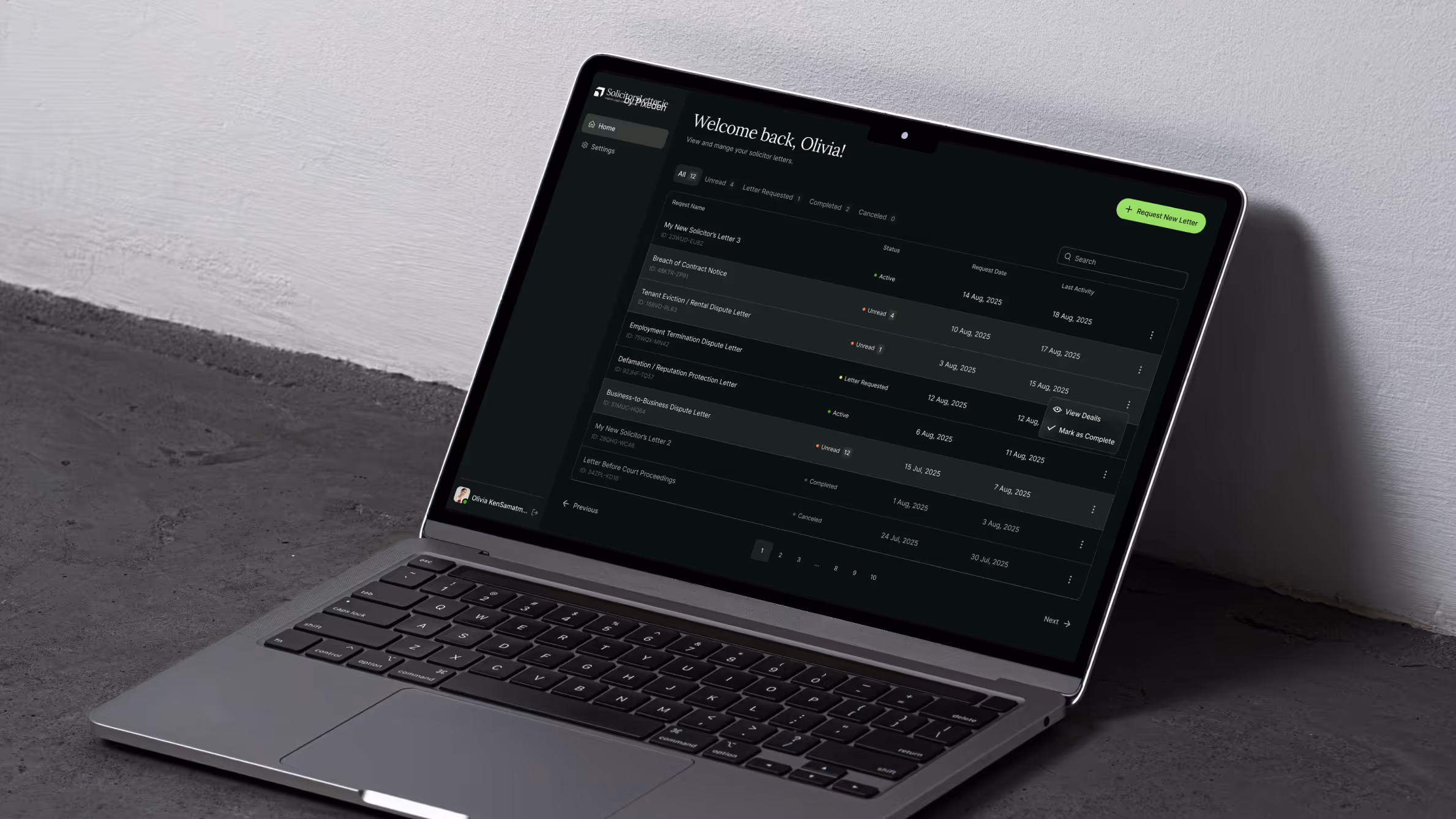
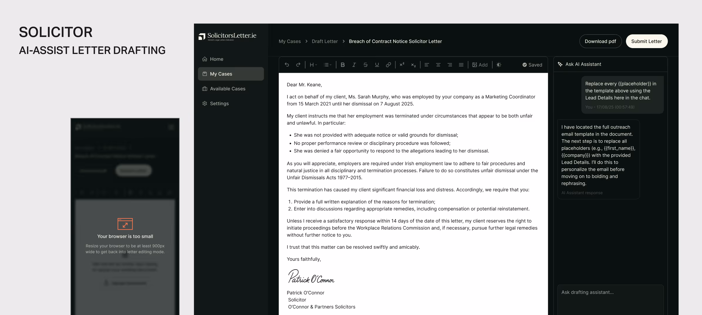
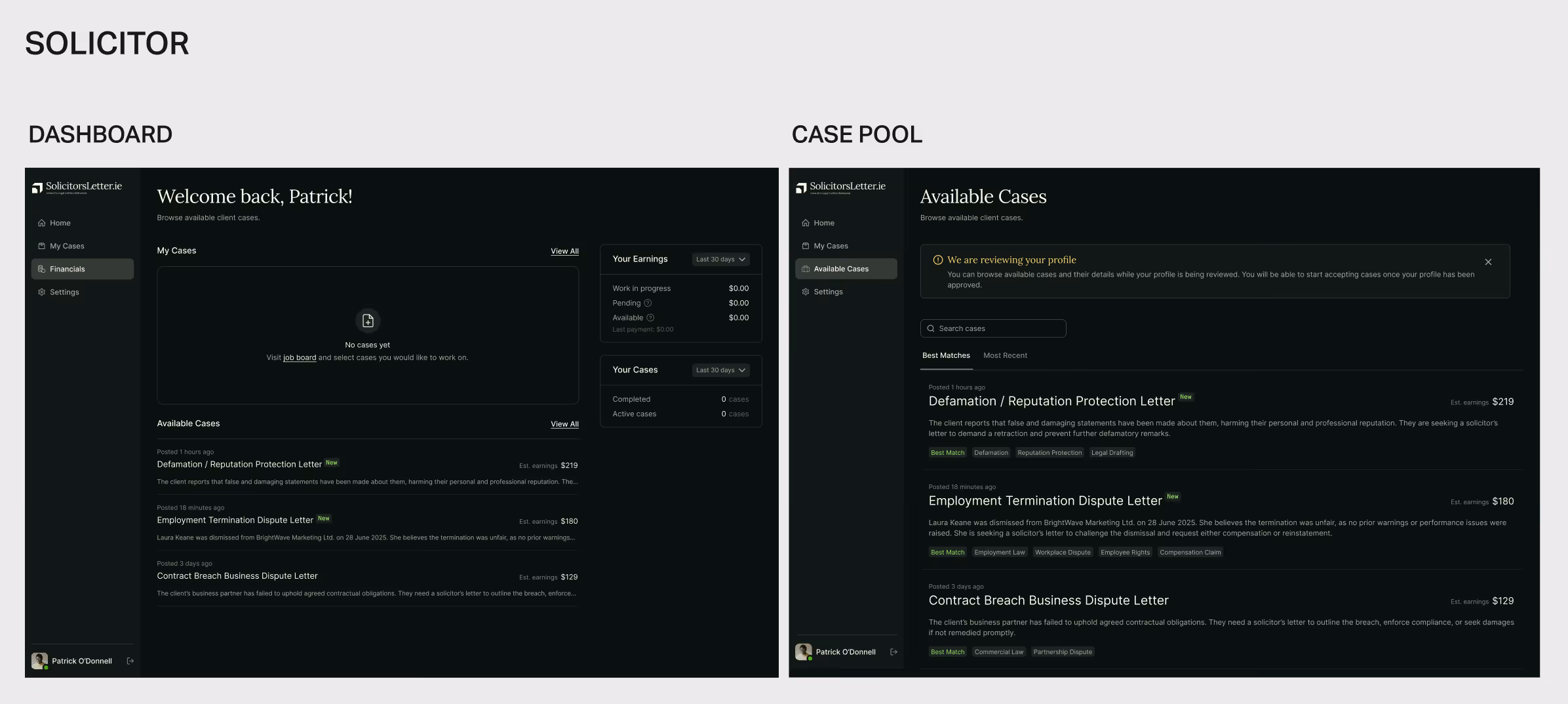
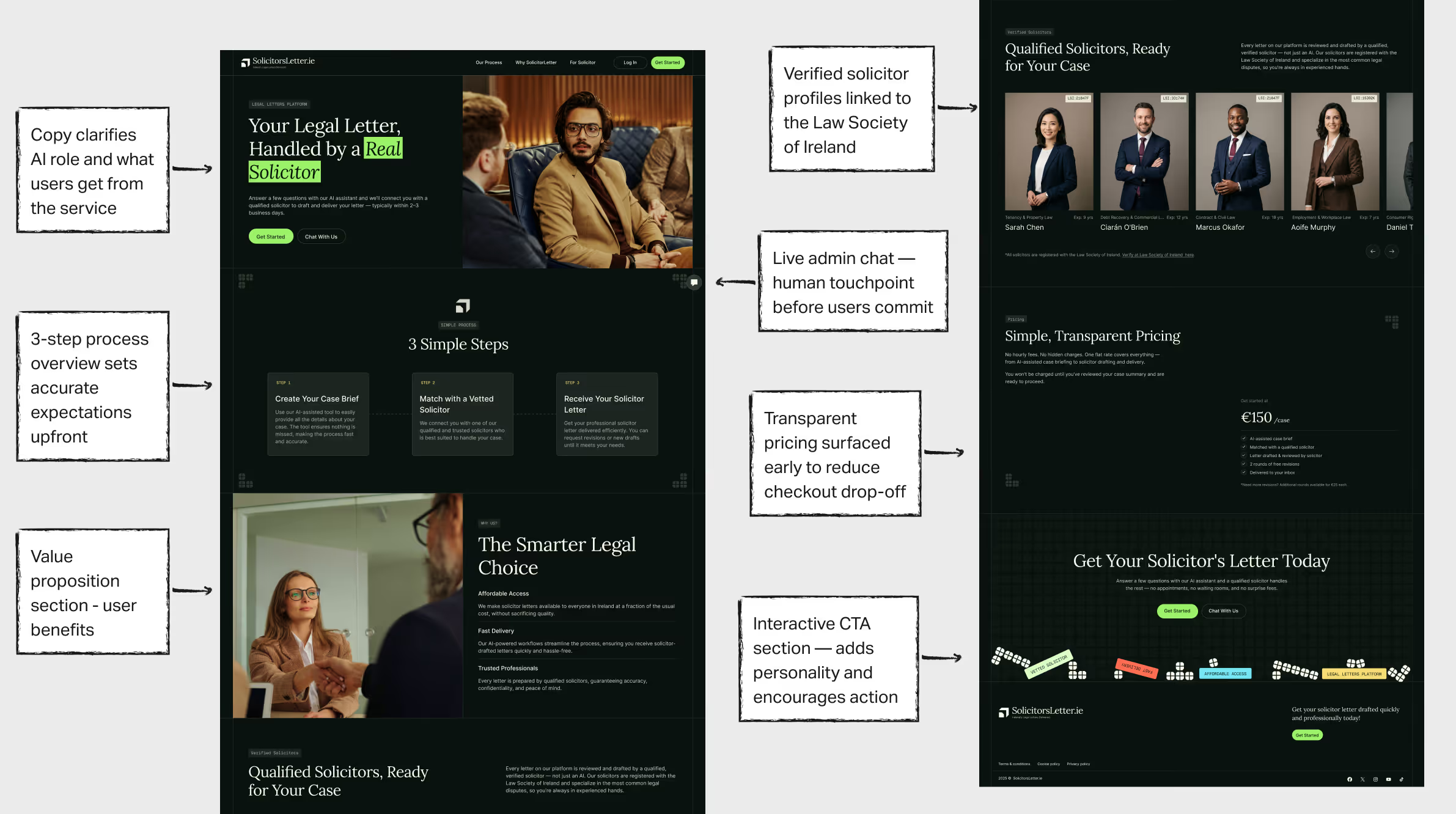
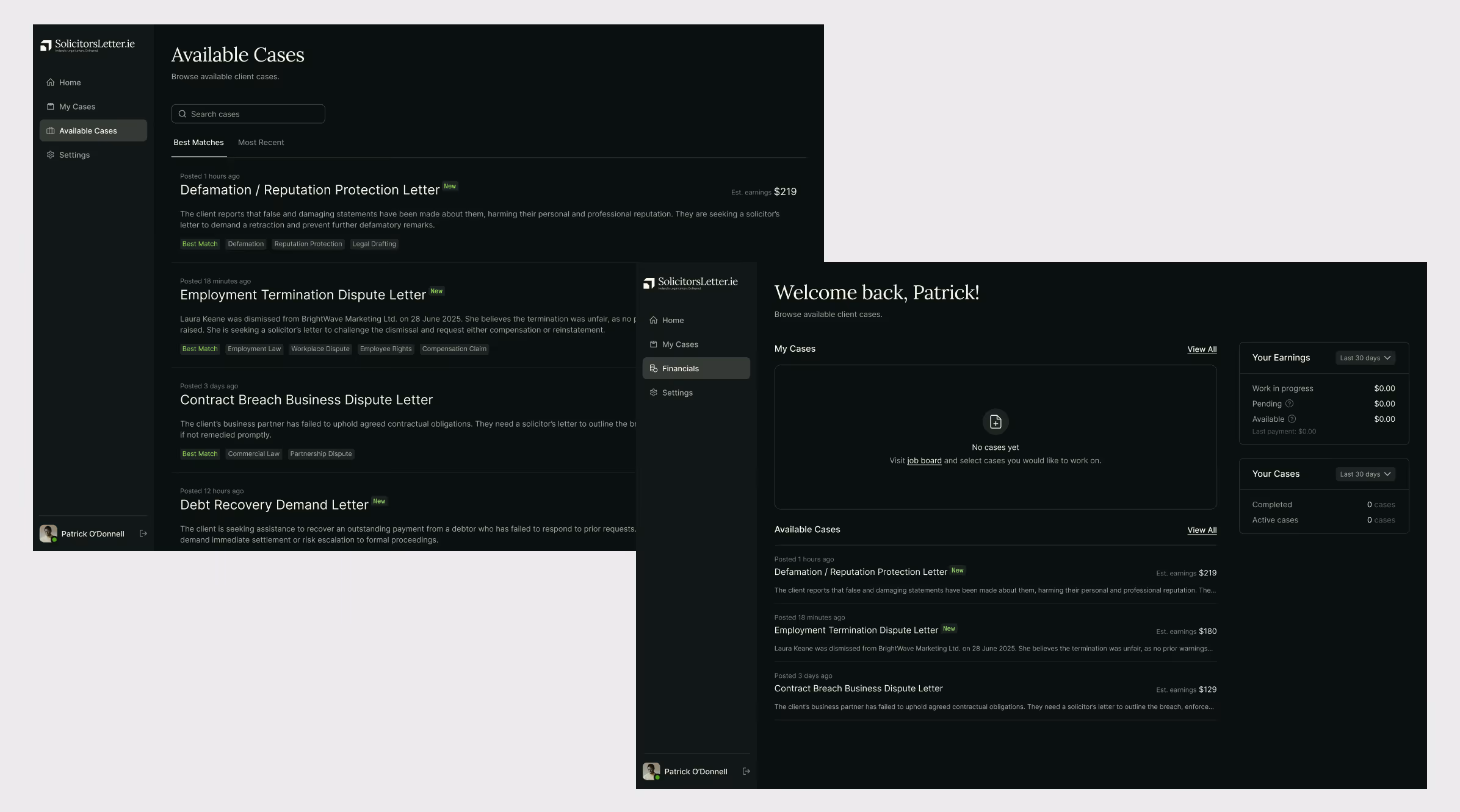
Design
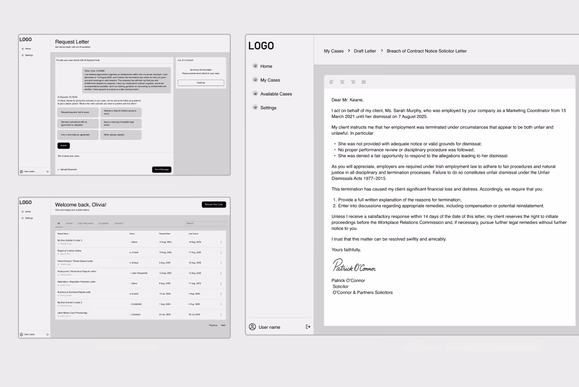
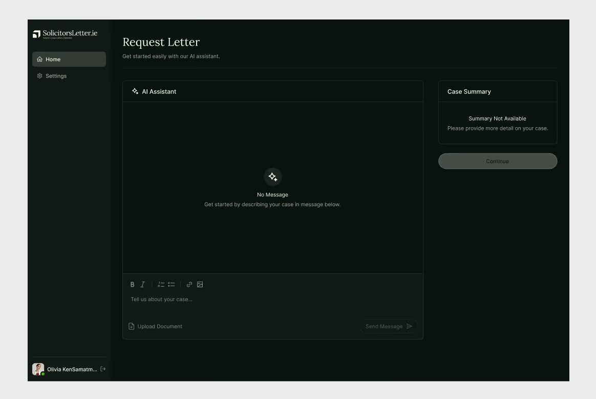
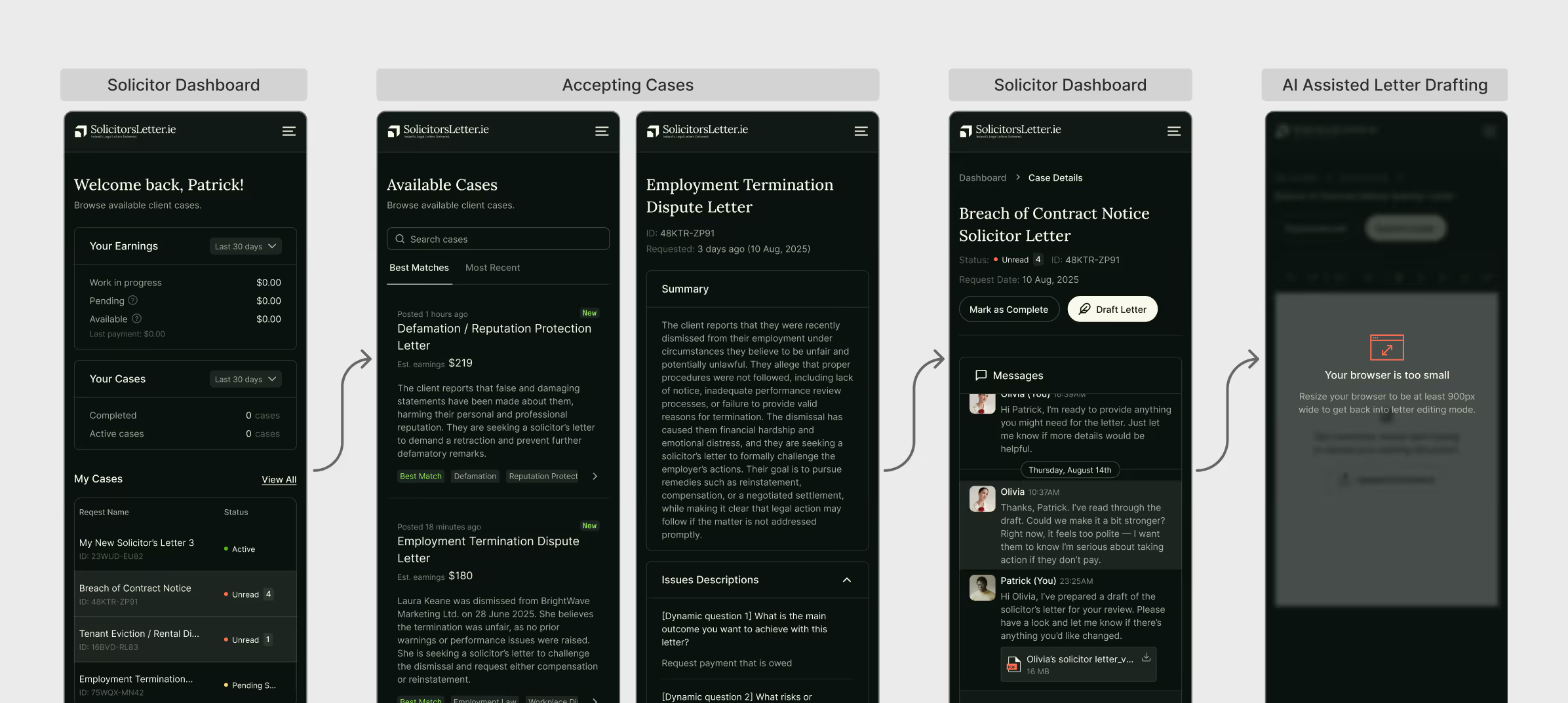
Key Pages
USABILITY Testing
Methodology
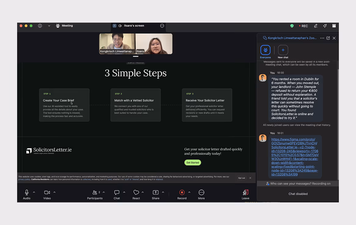
4 Moderated usability sessions via Zoom — one-on-one, 30–45 minutes each. I asked participants to think out loud as they interacted with a Figma prototype.
For the AI chat interaction, I pre-built multiple conversation states as branching prototype screens to simulate a genuine AI conversation without requiring live AI infrastructure during testing.
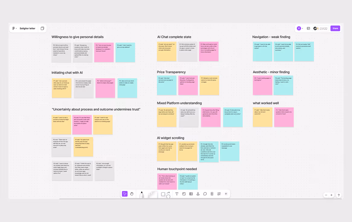
Affinity mapping
Observations and direct quotes from all sessions were grouped in FigJam. Seven insight themes emerged — spanning interaction friction, trust gaps, platform understanding, and what worked well.
Final Solution

Developer Handoff
outcome
- Paid consultation booking: a 15-minute paid session with a verified solicitor for users who need guidance before committing
- Expanded solicitor profiles: specialization, case history, and client reviews to strengthen platform credibility
- Comparative usability study: follow-up testing to validate whether the redesign resolved the friction points identified
- Solicitor onboarding research: a dedicated study on the solicitor registration and profile setup flow, not covered in this round
Learnings
- Users don't explore when they're confused — they freeze. Designing for openness isn't the same as designing for clarity. The chat screen gave users freedom but no direction, and freedom without guidance just creates friction. The real lesson was that good UX isn't about getting out of the user's way — it's about knowing exactly when to step in and lead.
- Users don't freely share personal details with a product they haven't learned to trust yet, especially in sensitive context like legal. Establish credibility, provide value, and make integrate human touchpoint before asking for these details. The commitment follows the trust, not the other way around.