
Problem & Why Do It
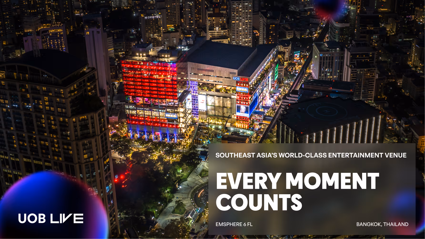
- Brand (CI) update: A refreshed brand identity centred around "The Bubbles," representing the joy and wonder sparked by every event and performance. This made original site visually obsolete and failed to convey the prestige of the live experience the venue offers.
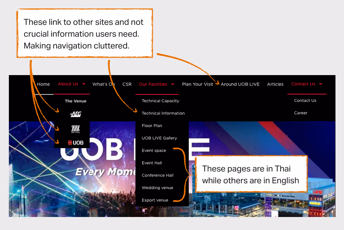
- Poor Navigation: Unclear navigation and calls-to-action made it difficult for users to find venue and event information. The inconsistent mix of Thai and English pages added further confusion, undermining trust and usability for both local and international visitors.
- Content management pain: The WordPress site meant the team had to rely on an external agency for every update, a significant bottleneck in a fast-paced industry where event schedules change constantly.
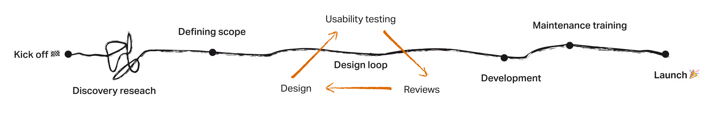
The process
DISCOVERY
User Goals
With input from the UOB LIVE’s marketing team domain expertise, we identified two primary user types: event-goers and event organizers, each visiting the site with distinct goals.
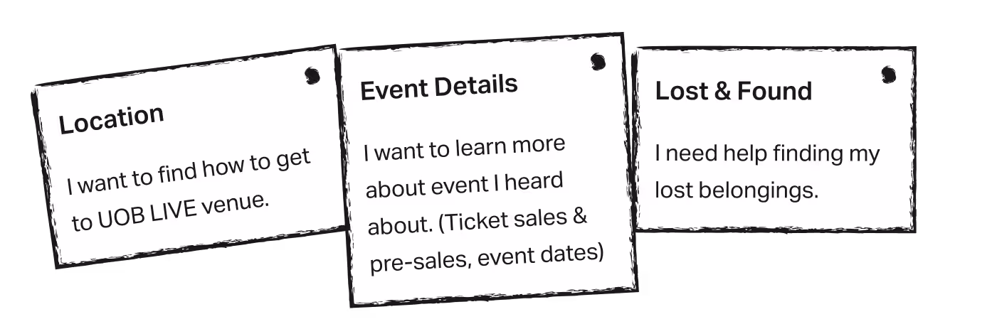
Event-goers goals
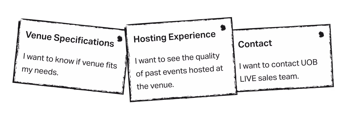
Event-organizers goals
Information architecture & Visual Directions
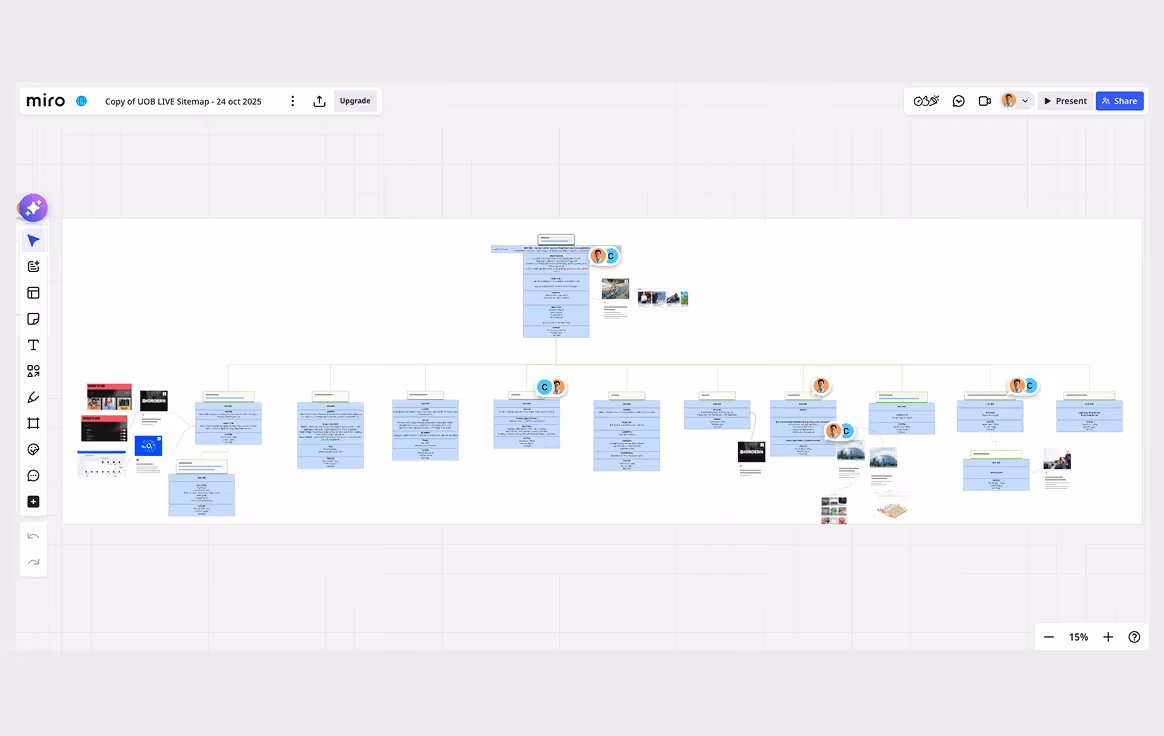
Information Architecture
Base on user goals and existing content on the site, I worked with the client’s marketing lead to draft a sitemap and content topics that will be under each page.
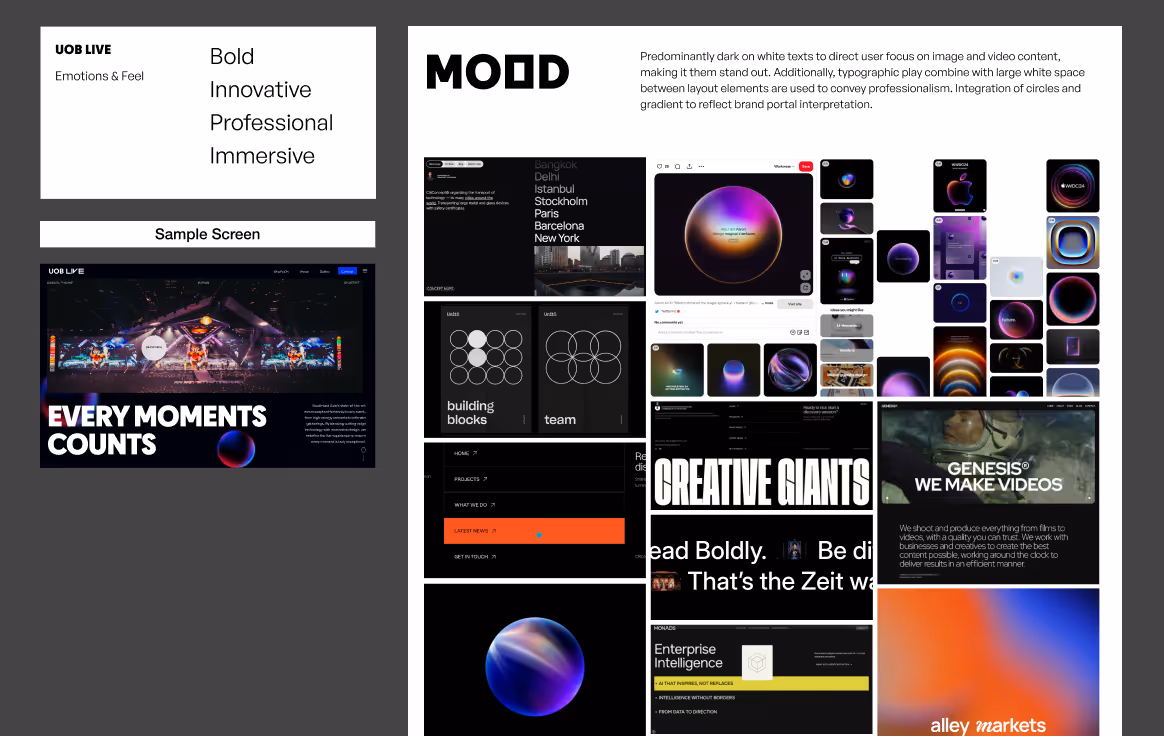
Mood boards
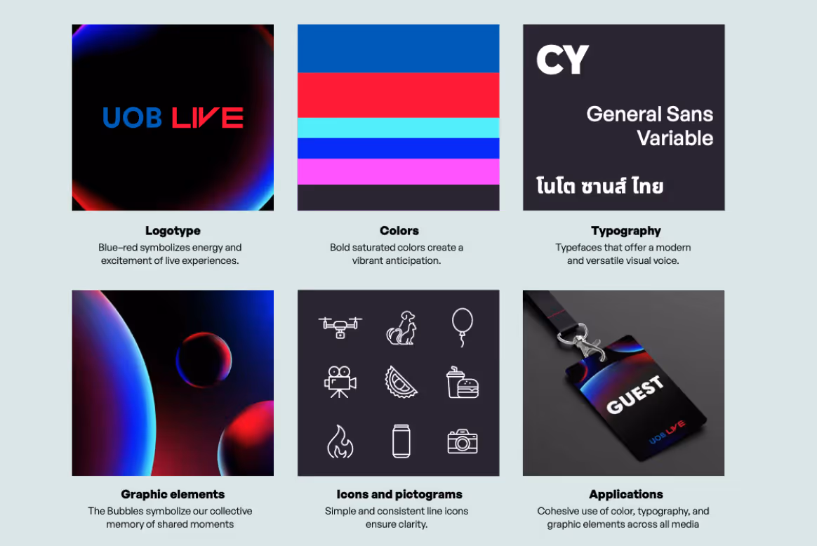
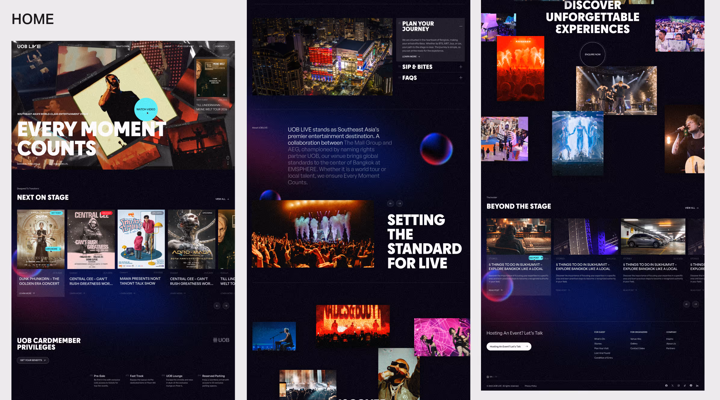
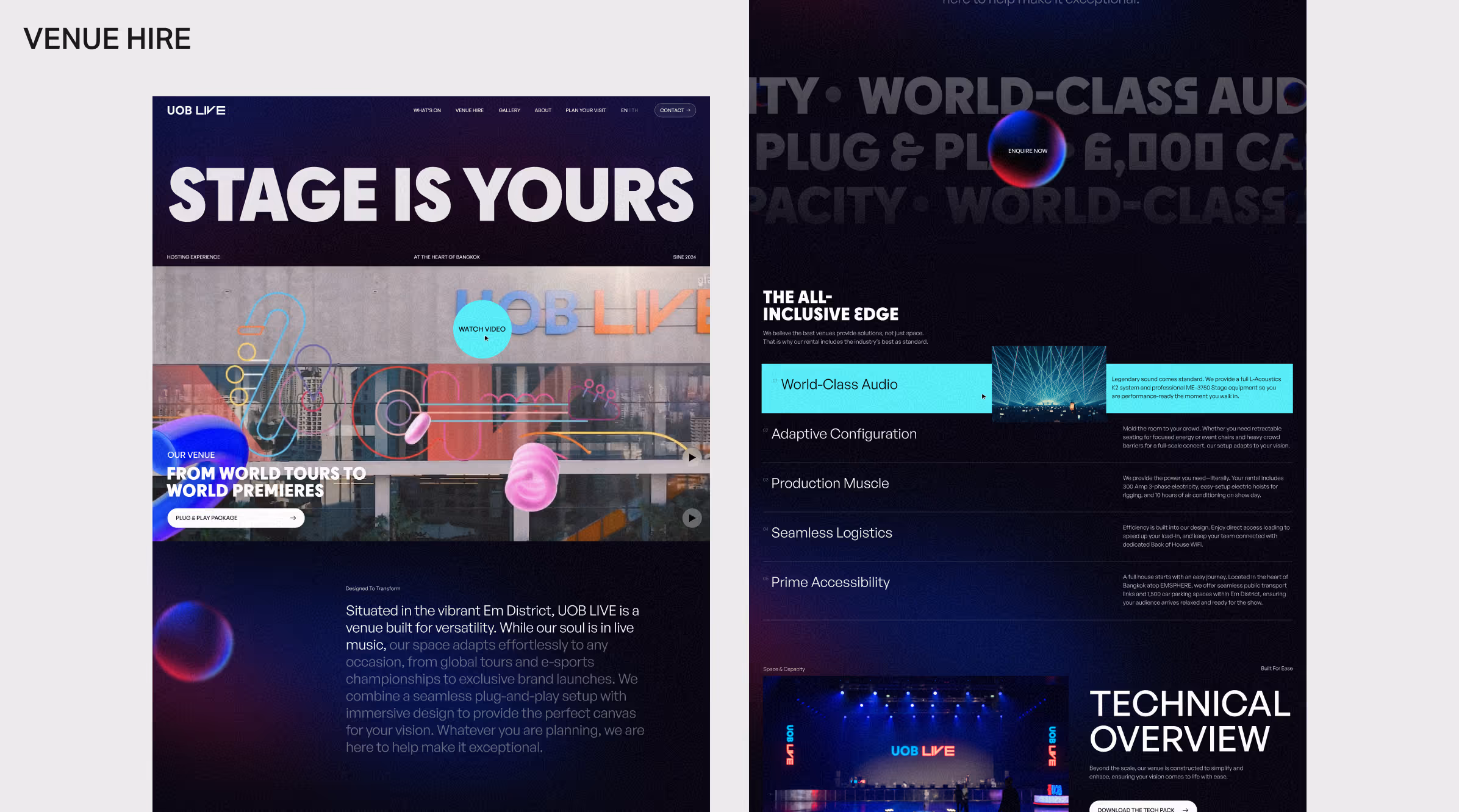
With UOB LIVE's brand identity centred around "The Bubbles," the creative direction was clear from the outset. Rather than exploring multiple concepts, I developed a single focused mood board and refined it through client feedback.
The visual direction centres on circular forms echoing the bubble motif, large typographic play, and a dark theme that puts image and video content front and centre — capturing the immersive experience the venue delivers. A sample screen was drafted early to support client alignment before moving into full design.
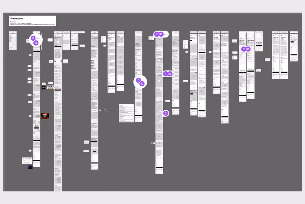
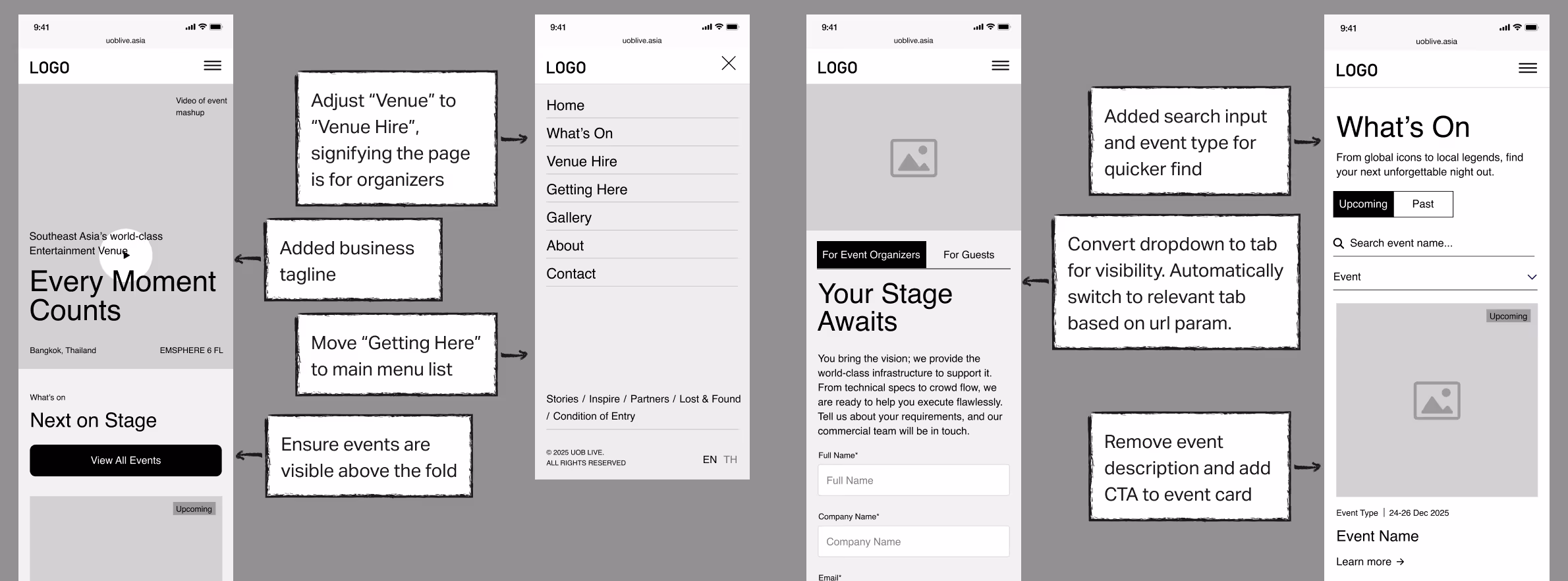
Wireframing
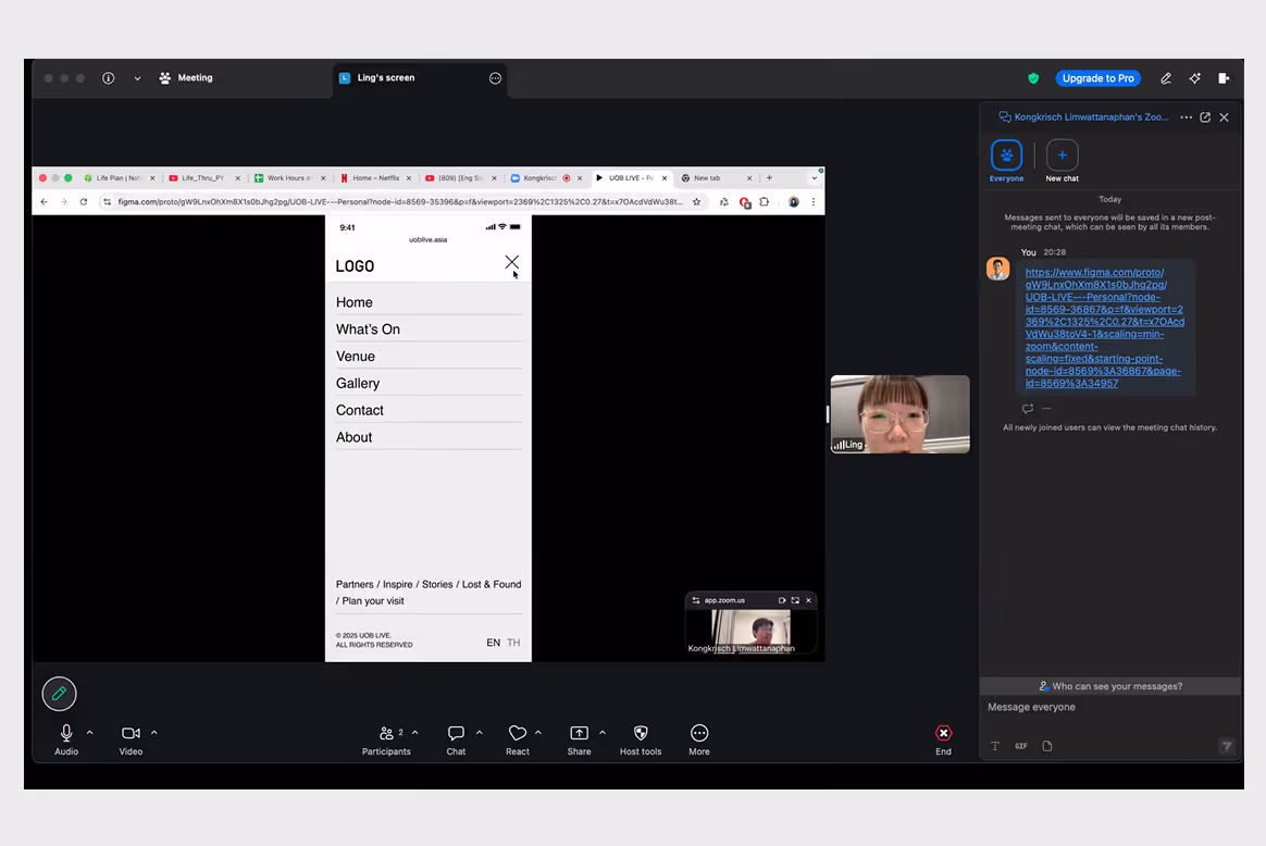
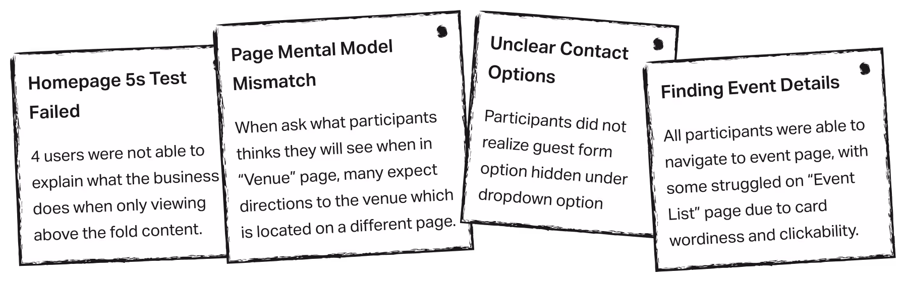
User test findings
UI Design
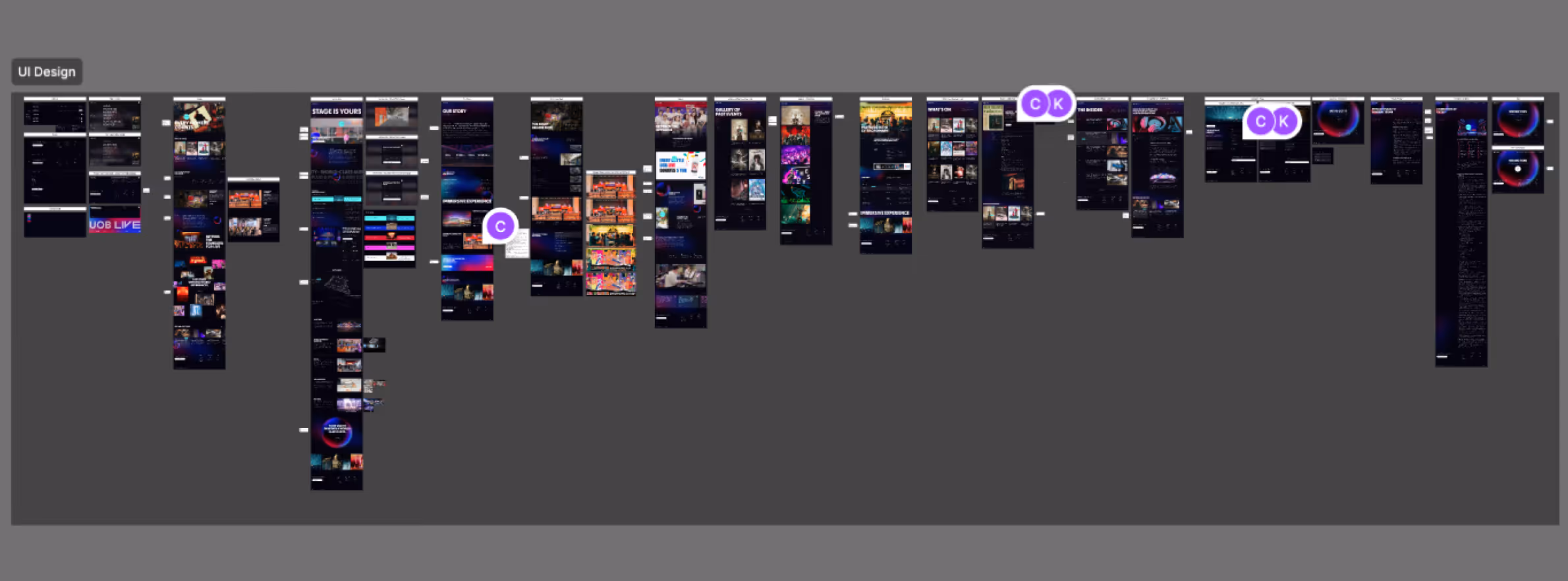
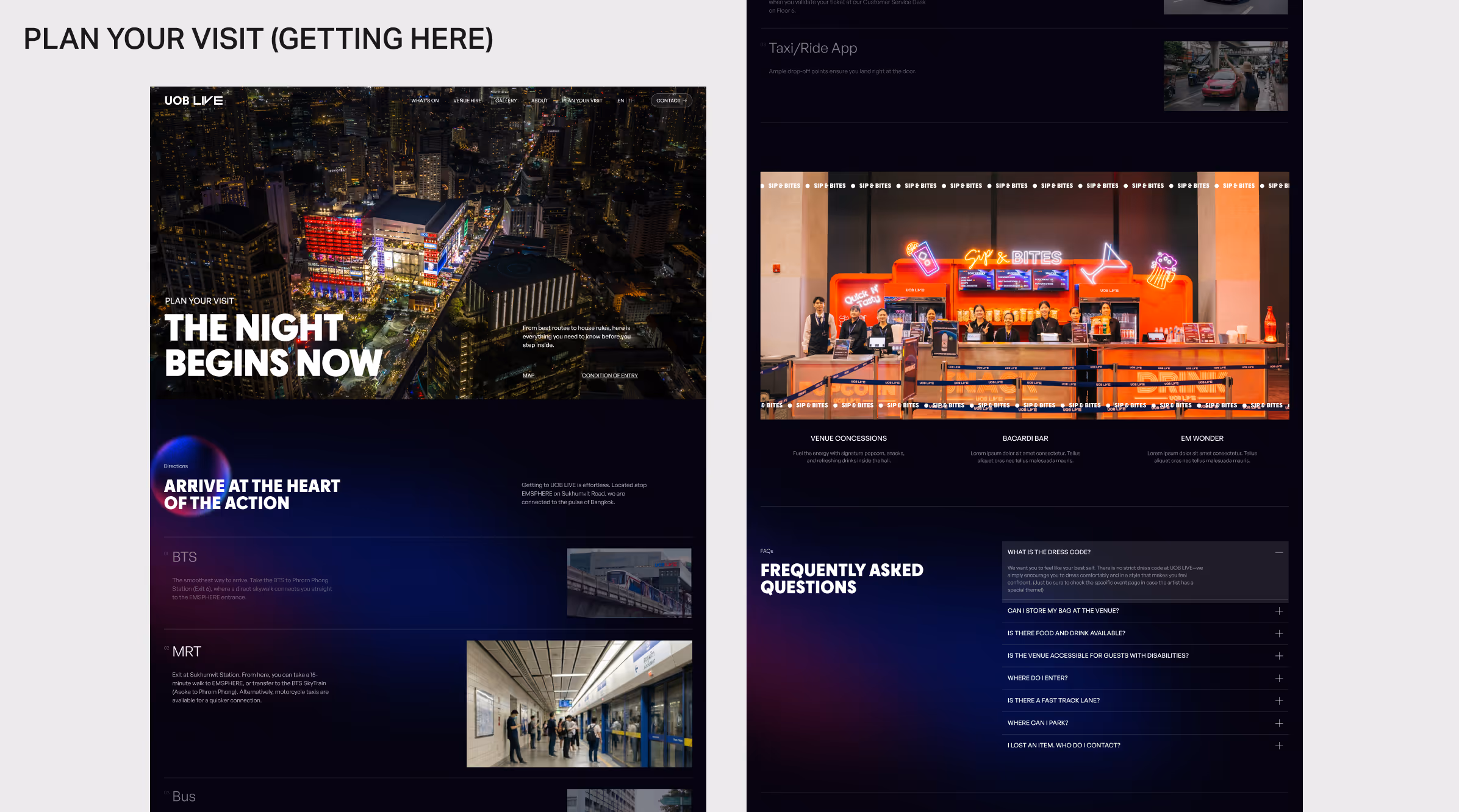
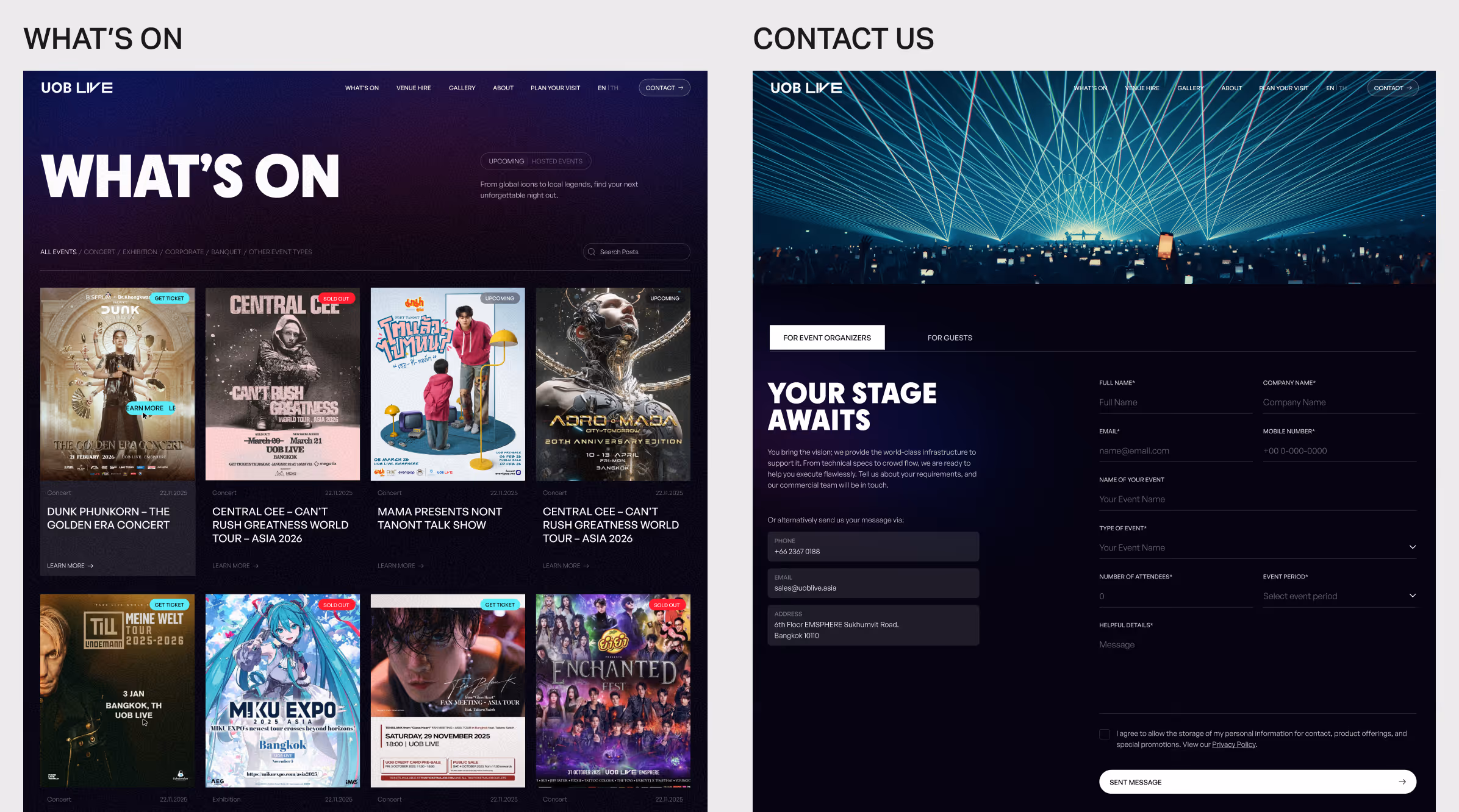
Key Pages
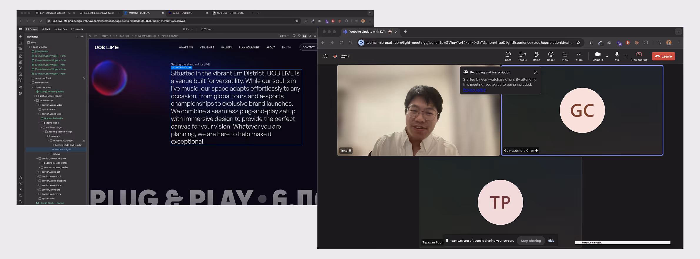
Development


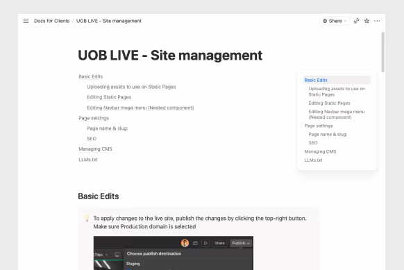
Client Training
outcome
- Conversion tracking: The marketing team should implement conversion markers to track event organiser form submissions, linking them to Google Ads campaigns. This would enable data-driven A/B testing to improve enquiry rates over time.
- Usability test with event organizers: Surfacing friction points that might be overlooked or are difficult to anticipate without direct observation.
- Site expansion: As the site matures, there is opportunity to deepen engagement through interactive campaigns, games, and loyalty-driven modules, giving users more reasons to return beyond event discovery and driving long-term brand advocacy.